AQI Visualization for Oregon#
Python Cartopy Pandas xarray NumPy Seaborn Matplotlib GeoPandas
01/2023 – current
Overview#
Analyzed satellite data on carbon dioxide levels and air quality index (AQI), visualizing spatial distribution and time-series trends across Oregon counties using Python.
Mapped CO2 values to counties throughout Oregon using satellite NetCDF data and shapefiles
Cleaned and integrated air quality, temperature, and wind data from multiple sources
Developed custom functions for plotting geospatial data
Created interactive visualizations with Jupyter ipywidgets

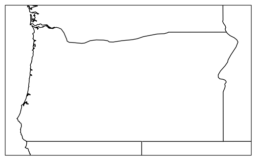
Air Quality Index spatial distribution across Oregon counties.#
Methodology
The project processes satellite CO2 data from NetCDF files alongside EPA air quality index measurements. County-level shapefiles enable geographic mapping of environmental indicators.
Data Sources:
Satellite CO2 data (NetCDF format)
EPA daily AQI by county (2021–2022)
Daily temperature and wind data for Oregon counties
PM 2.5 measurements for Oregon (1999)
Processing Pipeline:
Load and parse NetCDF satellite data with xarray
Clean and merge EPA AQI tabular data with Pandas
Join environmental data to county geometries via GeoPandas
Generate choropleth maps and time-series plots
Technologies#
Category |
Tools |
|---|---|
Data Processing |
NumPy, Pandas, xarray, netCDF4 |
Visualization |
Matplotlib, Seaborn, Cartopy |
Geospatial |
GeoPandas, Shapely |
Interactive |
Jupyter ipywidgets |